Sunday, October 5, 2014

A Little Sunshine

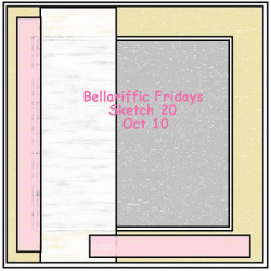
Today's post is just a bit of fun I decided to have on Friday night after spending ALL day in bed with the most wicked headache.  I finally got to feeling normal around 9:30P and sat down to do a bit of coloring.  I'd seen the Bellariffic Friday's sketch for October 10th and thought I'd give it a shot.


So I took the Uptown Girl - Audrey Loves Her Makeup and colored her using my prismacolor pencils and odorless mineral spirits.  I fussy cut her and sandwiched her between two pieces of acetate.  The frame was made in the card front in both pieces using the Taylored Expressions - Frame it Up 2 die.   I placed the patterned paper on the front of the card temporarily - and die cut both pieces at once to ensure it would be accurate.  Then before adhering the patterned paper (My Mind's Eye - The Sweetest Thing) to the card base I added Audrey between the two pieces of acetate.  This created a beautiful window that would show the sentiment on the inside of the card.


I was able to draw a clean black line around the frame to accentuate the shape just a bit.  To do so, I fit the die back into the window and use a thin black marker to trace around the die. I think it adds just a bit extra. 


The inside of the card ready "Some days you just have to create your own sunshine" and is from another Uptown Girl pair - Sunny is Stylish.


I think she turned out lovely!  Thank you all for stopping by today!!

Thursday, October 2, 2014

Believe in the Good of Everything - Super Quick Card Idea!

So today I wanted to share a quick technique that I thought I'd try.  I took one of the patterned stamps from the Altenew Dodecagram set (the line drawing stamp right above the thank you and celebrate stamps you see pictured below).

Instead of stamping it just once in each spot, each time using a different color of Distress Ink (Picked Raspberry, Mustard Seed, Peacock Feathers and Spiced Marmalade) rotate that stamp ever so slightly keeping the center lined up with each impression to get the awesome pattern you see below.   I'm pretty sure that this technique would work with any of the mini Distress ink sets from Ranger, all of the colors seem to be coordinated for you.

I didn't really measure - and they're by no means perfect but I was thrilled with the result:


A little closer reveals just how cool the colors look together, and how amazing the pattern is.  I'm in love with Geometric Stamps!!!


The "Believe in the Good of Everything" sentiment is one that you saw in the post on Sunday, this phrase is resonating with me at the current moment. I'm almost using it as more of a mantra at this point.  Don't know about everyone else, but this week has been a gigantic ball of stress smeared with thick layers of work and topped with exhaustion sprinkles...

Thanks for stopping by!!!

Tuesday, September 30, 2014

Organizing all those Project Life Cards


As promised I wanted to share with you one of the things that has helped me stay organized with all of those 3x4 and 4x6 Project Life/Pocket Scrapbooking cards.   In August I took a course from Studio Calico called Workspace - well worth the $15 spent.  With that class I learned about how I think, what I buy, what I keep and how I work best.  

The storage container is the Large Journaling Card Caddy from Organize More - took about 4 weeks to get, but totally worth it.  Its made of wood, and comes painted white.  The dividers you see there are removable making room for the 4x6 cards you see in the back left and right. 


I've found that when everything I have is well organized, then I can be more productive over all.  I used to keep all of my project life cards stored in one of the drawers in my JetMax cubes, but I found myself shuffling through endless decks of cards to find the card that I know I got as part of a kit four months ago - now I can look by color which makes things much easier.  


The Workspace class had a digital file for the Silhouette that I used to make the dividers that you see below.  I used only the colors that coordinated with my craft room.   Each divider has a specific set of colors - for colors that were more abundant I was able to break them down.


For example, I could have lumped ALL the green into one category but I've broken it down into green, lime green and blue green to help me separate a bit more.   There are also spots for title cards, multi-colored cards (those cards with so many colors its hard to categorize them) and then specialty cards.  

Organizing the cards that I currently own makes my monthly Project Life projects less frustrating as I no longer have to struggle to find what I'm looking for.  AND by knowing what I have, I'm able to stand in my local scrapbooking store and ask myself "Do I really need this?".  If you're looking at your space wondering what you can do to make it work for you - whether it is big or small I highly recommend the Workspace class from Studio Calico.

Thank you all for stopping by! 

Sunday, September 28, 2014

Hello September - Altenew September Challenge

Welcome back!  I've spent most of my Sunday attempting to mentally prepare myself for next week. For some reason work has been extremely busy - to the point where I'm pretty sure my brain is mush when I get home.  I'm just now starting to feel normal -- and tomorrow is Monday, not sure who designed all of this - but the weekend should be much longer.  I'm sure you all can agree.

In any case, today's post is a bit special for me. About two weeks ago I was taking a mental break and happened upon the Altenew company on Simon Says Stamp - its been a long time since a company was able to captivate me as much as this one did.  There's something fresh in their designs made me want all of their stamp sets.  I'd like to introduce them as well if you've not already visited their blog - you can find it here.

Today's post is an answer to their September Challenge: From the Craft Room:


Here's my entry:


Everyone else had submitted a card - and every submission was so beautiful!  But I thought I'd mix it up.  The last Sunday of every month I put together my project life page for that month.  I only do one spread per month, and because I don't have children of my own -- I don't think everyone wants to see a weekly spread mostly about work. 


In this case I mixed in some of the cards from my Studio Calico kits - and the yellow paper is Webster's Pages, the woodgrain is My Mind's Eye.


I had a card that had repeated text diagonally - in this case I used the Sentiments & Greetings stamp set to make my text for my lil' Hawai'i Princesses.  They're my best friends children and I love to include them when I can - as I live in Colorado I don't see them often, but it is fun to watch them grow on facebook.


Thought it would be cool to make a title card as well using a stamp from the Thoughts & Reminders set.  I stamped it on velum using Stazon Jet Black ink and then layered it on top of a card from a previous Studio Calico Project Life kit. 


The title page is also a good use of a stamp that was made originally for a card - I'm all about having multiple uses for things.  This was just stamped in Pear Tart Momento ink and then outlined in black pen. 


I was also able to build in some backgrounds using the Dodecagram set - stamped in PTI Smokey Shadow dye ink and Pear Tart Momento Ink.


Well, that's it - what do you all think?   Head on over to the challenge site to see what the other amazing folks were able to pull together using these dynamic stamp sets. Thank you all for visiting - may you be blessed with a calm week.


Thursday, September 25, 2014

Step by Step - Happy Birthday!

I thought I'd share a card that I recently made - I have to admit I thought it would take me less than 20 minutes to and ended up taking me much longer.  I'm what you would call a perfectionist, and you know when you get to the very last point and attempt to put the stamp on the back saying something to the tune of "made with love" - that's when you get that stray mark on the otherwise perfect white piece of card stock.  So at the end of this you'll see two cards, one has just a bit of a smudge on the backside of the card.


The super nice part about the dye inks from Papertrey Ink is that they're somewhat transparent.  So you stamp the first as you see here: 


And then when you stamp the following colors - you can see through them and they mix nicely to create other colors.  At first I was terrified of this technique, I'm such a perfectionist that mixing colors or crossing colors made me twitch, but once I tried it it was super neat!  You just have to find the correct inks and colors.  


Once I was okay with the colors - I stamped the happy from the set.  And to be honest it was stamped more than once in the Jet Black Archival Ink from Ranger.  I wanted it dark over all that color.   Not pictured was I did the same thing with the Birthday sentiment from the same set. 


On the inside of the card I did a mini-version using the smaller paint splotches and the heart from the Wet Paint set.  All black ink was given a touch of class with some Wink of Stella clear.


Here's a close up of the results!  I was super happy with how this came out - the colors ended up so vibrant don't you think?


Thanks for visiting today -- if you have any questions or comments please leave them in the comments section below!  Happy Thursday!!!


Supplies
Paper:
Stamps:
Ink: 

Tuesday, September 23, 2014

Welcome to my Creative Space

I thought I'd share my creative space with everyone today.  I purchased a house a little over two years ago and since then have been slowly working on making this space my own.  It honestly is an oasis of calm in my chaotic world.  When I'm at work I'm typically dreaming of my next project and my quiet time here.


The room is long but narrow with doors at either end along one wall along with two closets.  So I only had one major wall to line everything up against.   I know that there are many creative spaces shared on the Internet - I'm very mindful that they all end up looking the same, but I'm hoping mine stands out with the unique decorations and organization.


The saying "a place for everything and everything in its place" is my motto of choice.  I've made sure that everything I purchase has a proper home, that I know what I have and that when I'm done I put everything away.  A clean space clears my mind to be even more creative as I can find everything I'm looking for, most of my items are a quick reach from my chair and everything has a home when I'm done.


In future blog posts I will share some of the things that make my space unique and organized to help others find ways to craft in a budget friendly way.  If there are things you'd like me to share in future posts about how I organize or questions you have for me about my space or what I've done please leave a comment below.  I hope you all have an amazing day!

Sunday, February 24, 2013

With Gratitude - Mojo Monday challenge #281

Wow - another year has passed and here I am writing a blog post.  I've been totally distant for almost a year to anyone who may still read this!!  In that year I've moved into my own home - like a real adult!!  I have pictures of the craft studio coming later this week.  I've been snowed in all day and started looking at my list of challenge blogs -- where I encountered the Mojo Monday challenge for this week.    So here's what the sketch was for this week:

 And here's what I've come up with:


I used the Thankful Accents stamp set on PTI Simply White card stock with Ranger Archival Black Ink.   I put it up on pop dots, over the paper with the sentiment on it.  The other two circles were cut using a 2.5" circle paper punch out of scraps (the stripes are from the My Mind's Eye new Collectable collection).  I then took a circle stencil that was slightly smaller than the paper circles and drew three circles all offset from one another using a black pen.  Some black seam binding and a black card base and everything was set. 


As always the inside is designed to match.  I have the perfect person for this card!

Thank you all for stopping by!

Related Posts Plugin for WordPress, Blogger...